
Stronger calendar colors
complete
F
FranSZ
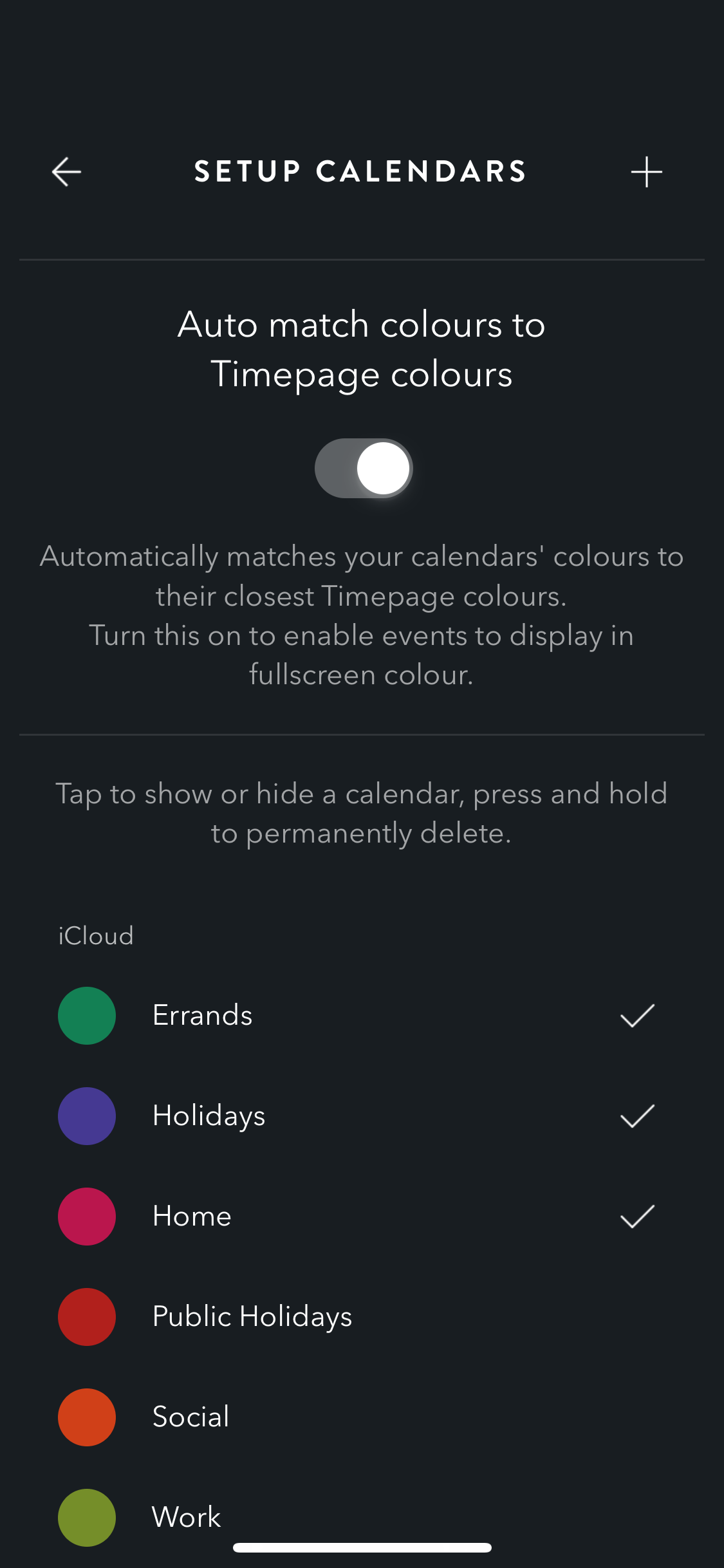
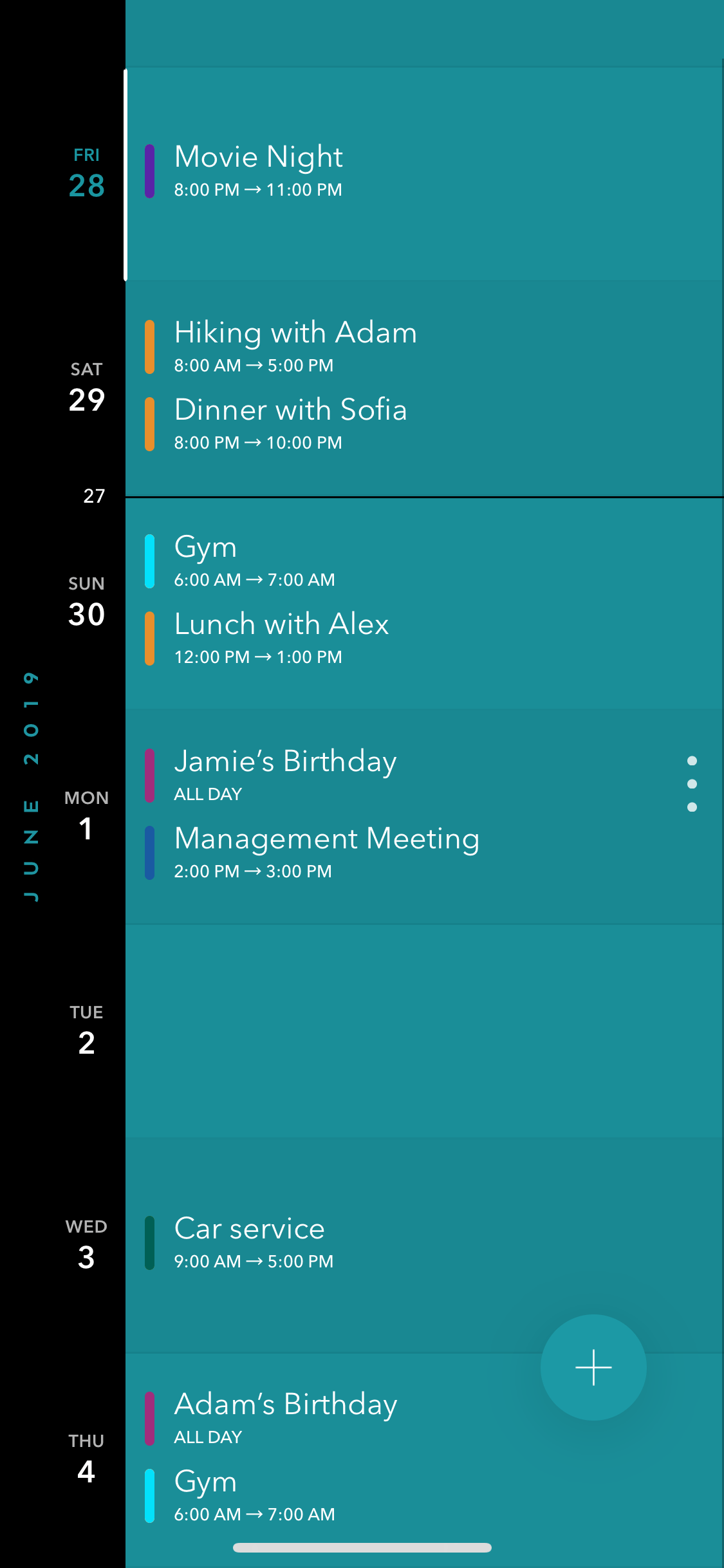
Currently the different calendars to which each event belongs is marked by a small dot under the event's name.
This might be too discrete. Sometimes, I would like to see at just a "coup d'œil" how my day is going to be / keeps going. That is to say, in a second I'd like to know that I have something on "social", independently of wheter I it's "Brunch with Nicky @ Starbucks" or "Dinner with Mark @ Güerrin".
I would prefer to have the possibility to set how "intense" the calendar is shown. Say:
- Option 1: the small color dot
- Option 2: the event edge's are colored
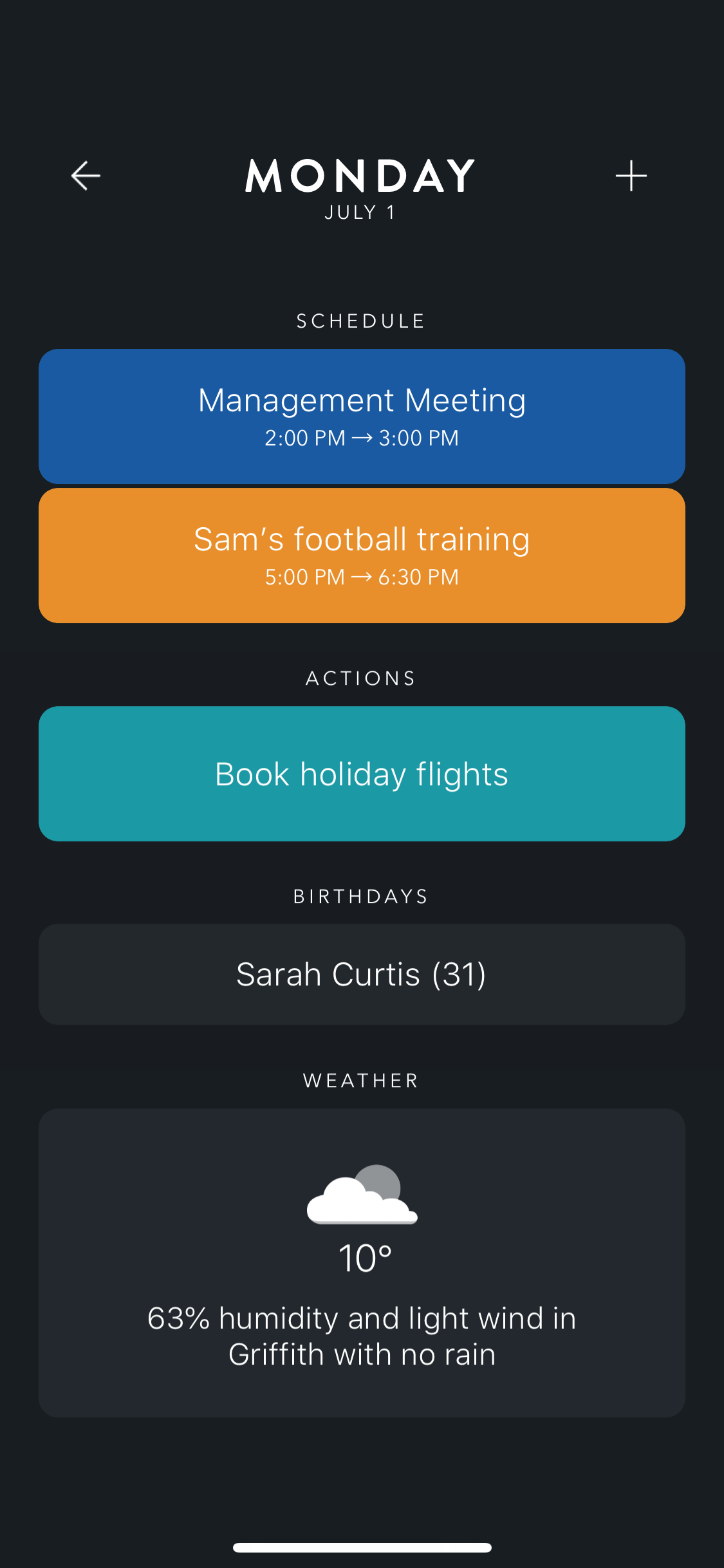
- Option 3: the whole event is colored (a la Actions entrances)
If this could also be present at the daily briefing I'd say this would be just another awesome feature to an already awesome app!

Ben Hamey
complete
Hi everyone - this was a great suggestion and we're pleased to announce that today we have released all new features for how your calendar colors are managed. Your event colors are much stronger on the week view and you can make each event appear as a full colour card. Try it out and let us know what you think!
M
Max
Ben Hamey: Great news, thanks! But how do I make an „event appear as a full colour card“? I didn’t find any such option in the latest version.
K
Kyle Andrew
You’d think this was frivolous but the little dot is great and I like my calendar colours. I wanna see it bigger too!
F
F. Meilleur
Options 2 & 3 are better IMO
Simon Burbidge
planned
Maf
With color cards, then you could sort alphabetically all-day events.
Alex Louden
Alex Louden
Merged in a post:
Allow calandar colors for tiles in day view
T
Tom Kercher
I'd love to see my calendar entries with the cakendar color as the tile. Other calendar apps (calengoo/informant) allow this and it helps to differentiate entries on a given day.
The dot is nice but doesn't really help if you have lots of entries.
Joey M.
This is the main thing holding me back from subscribing to the app, as Calendars 5 by Readdle does a much, much better job as far as identifying which calendar an event comes from.
I would highly prefer option 3 (listed above), but would settle for option 2 as well. The current colored dot feels very miniscule and lackluster, as far as calendar identification goes.
If this changes goes through, you’ll have at least 1 more subscriber and I imagine many more to follow as well.
B
Bethanny Brooks
Joey M.: this was holding me back from subscribing too but I finally did hoping you increase the size of the text and the boldness. It is very difficult to read on the list view of the calendar.
ramoore44
Absolutely agree! Especially options 1 & 2. Woukd be a great update.
S
Soraya
Agree, especially option 2/3
Load More
→